The Financial Times publish these graphs of Covid-19 fatalities every day, here.
This graph shows that deaths in Italy, Spain and the United States are still increasing at a more rapid pace than they had in China, at a similar time (number of days after the 10th death in the country).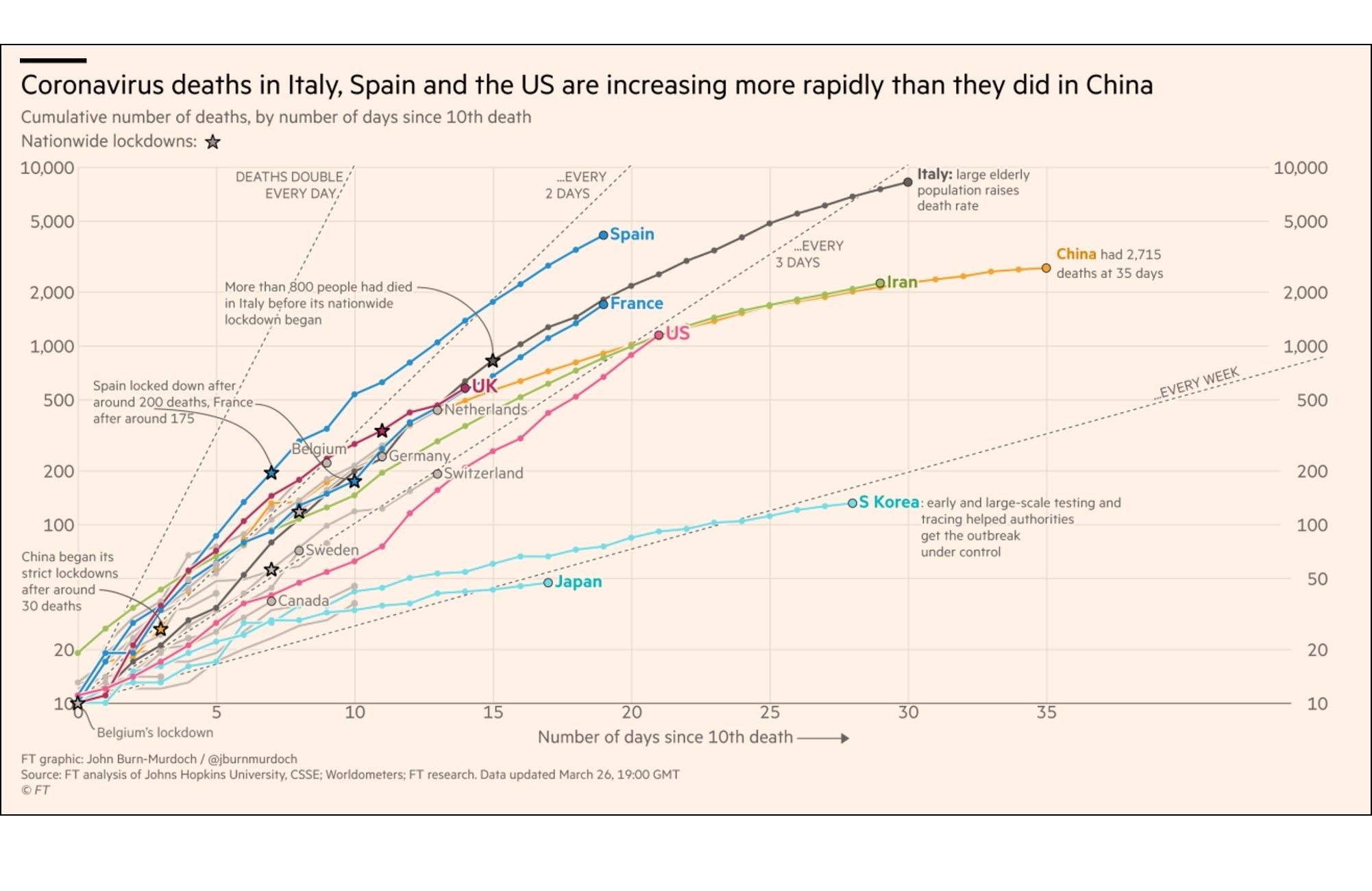
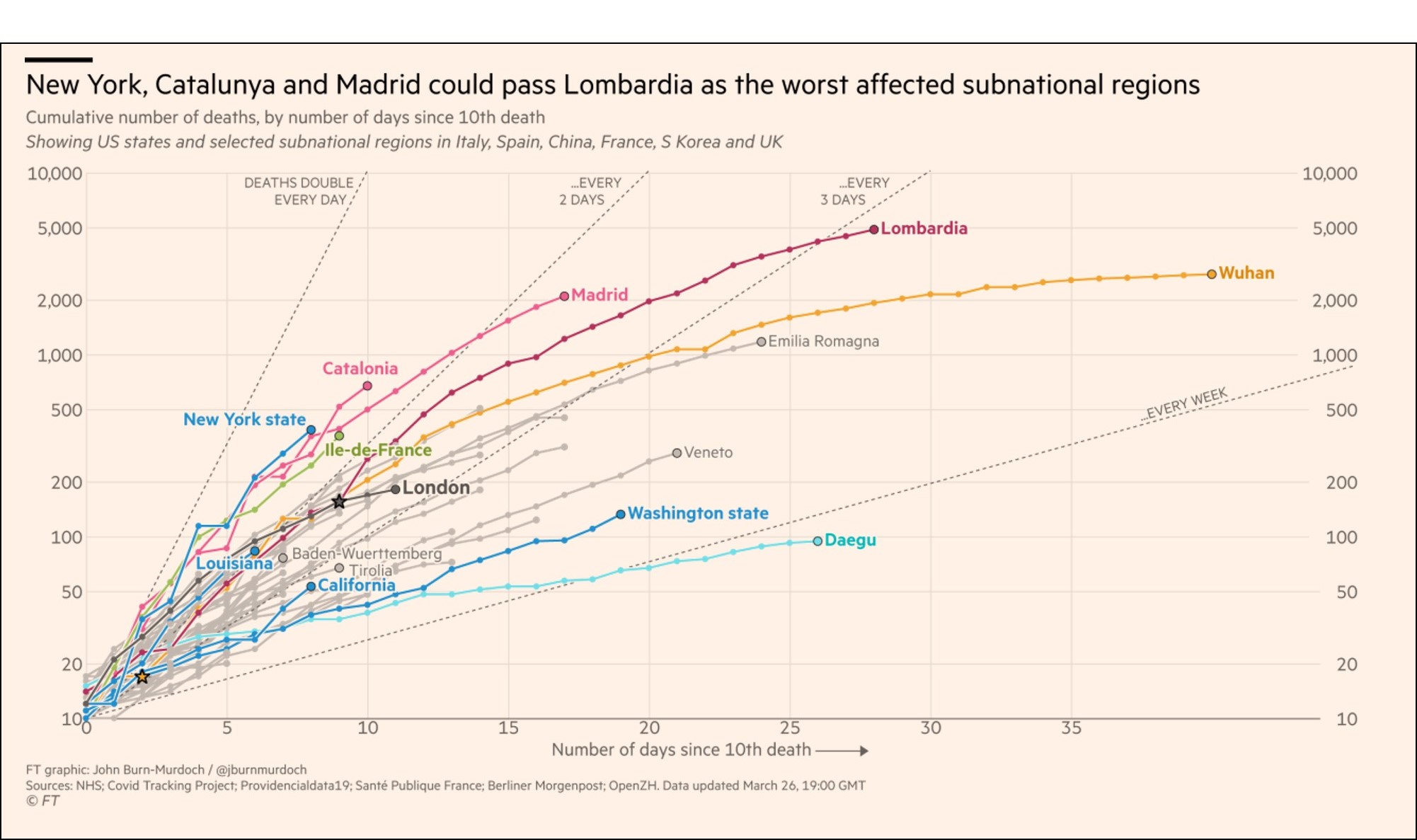
This graph shows that the New York State, the Catalonia region and the Madrid metro, could eventually pass Lombardia, Italy, as the worst affected subregion. Washington State and California seems to be doing relatively better than New York State. The higher rate in New York State could be related to the very dense population in NYC, and the heavy use of crowded public transportation there.